


Stand at a corner of the Parthenon and sight along the stone platform the columns stand on, the way a carpenter checks a plank. The platform is not level. It bows upward along its length, the middle a few inches higher than the ends: too slight to notice from the path, plain once your eye runs along the edge. Each column swells slightly as it rises and leans a little inward. There are almost no straight lines in the place.
For two thousand years the explanation came from Vitruvius: the builders were correcting the eye, curving the platform so it would not appear to sag and swelling the columns so they would not look pinched. In a paper published this year, an Oxford mathematician concluded that the supposed illusions either do not exist or are too small to notice. The curves are real. The correction is a story.
If the builders were not fixing the eye, what were they doing to it? One art historian’s answer is that the columns swell the way a body tenses under load.
We like order (symmetry, regularity, things lining up) because it is easy on the eye. But easy is not the same as beautiful. What actually holds our attention is order with a flaw in it: the Greek column whose shaft curves almost imperceptibly outward as it rises, or the small-seconds dial set low on a watch face, breaking a symmetry the eye had already begun to complete. Perfect regularity reassures, and it is faintly dull. Regularity nudged slightly out of true is what we end up calling beautiful, provided the whole still holds together. The eye, it seems, is less interested in perfection than in the evidence that something nearly reached it.
The proviso, that the whole must still hold together, is older than it sounds, and the word for it began in a workshop. Harmonia first meant a joint. In the Odyssey it is what fastens the planks of the raft Odysseus builds to leave Calypso’s island. Only later did it come to mean musical concord and proportion. Order is sameness: repetition, symmetry, the regular interval. Harmony is the agreement of unlike parts.
The sculptor Polykleitos’s treatise, the Canon, is lost, but as later writers record it, beauty lay in the relation of finger to finger, fingers to hand, hand to forearm, of everything to everything else. A saying attributed to him holds that perfection comes about para mikron through many numbers: usually translated “little by little,” though scholars disagree about the phrase. It may be the most useful thing a sculptor ever said about beauty, and nobody is sure what it means.
Francis Bacon, in an essay of 1612, put it more bluntly: “There is no excellent beauty that hath not some strangeness in the proportion.” A painter, he added, may improve on nature, but by a kind of felicity, “and not by rule.”
The science is more modest than the folklore. The Gestalt psychologists showed in the 1920s that we do not see a view as hundreds of separate patches of light. We see a house, trees, sky. The eye organises without being asked, and that much looks like instinct. The golden ratio has spent a century and a half failing to prove itself: measured carefully, the preference for it is weak, inconsistent, or absent. So the eye’s appetite for coherence looks innate; the proportions it calls harmonious are largely learned.
Music is where the evidence is clearest. In one recent study, a piece’s beauty peaked between monotony and chaos, while mere pleasantness simply declined as it grew more complicated. Feeling arises, one theorist argued in the 1950s, when an expected resolution is delayed or diverted. The eye, too, completes the pattern before it has finished looking. The deviation is the moment it is caught out.
Where, then, does slightly end? A misaligned hour marker is not charming. It is a mistake. Yet the column that swells by a barely measurable amount is a masterpiece. The difference, I would argue, is harmony. A deviation reads as life when the whole can absorb it, when it follows the object’s own logic, the way entasis follows the logic of a body under load. It reads as error when it breaks the object’s rule. The crooked marker breaks a rule the other eleven have just finished teaching. The column obeys a rule we had not noticed until it bent. This is a hypothesis, not a finding, but it explains why the same small departure can be a flaw on one surface and the whole point on another. A. Lange & Söhne’s Lange 1 makes the same wager on a dial: every display pushed off-centre, none overlapping another, the asymmetry held in place by a hidden triangle. Lange credits the golden ratio; the evidence suggests the coherence does the work.
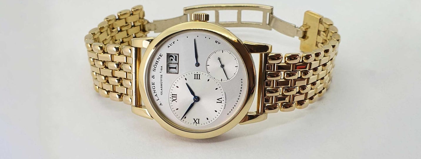
The watch dial is the cleanest place to test this. It is seen first, at arm’s length, and nearly everything on it negotiates between order and its breach. The case is a circle; the crown breaks it at three. The markers form a perfect radial system; a small-seconds dial at six interrupts it, as on Patek Philippe’s first Calatrava in 1932. Unequal hands leave the dial asymmetrical for nearly every minute of the day. Harmony is what keeps this from turning into noise: case, bezel and dial opening in proportion, hands that reach the tracks they point to, one typographic voice, empty space left empty. Inside that frame, the breaches read as life. Even advertising prefers balance to symmetry: watches are posed at ten past ten, often a minute or two short of it, so the hands frame the dial without mirroring each other. (There is also a theory involving smiles.)

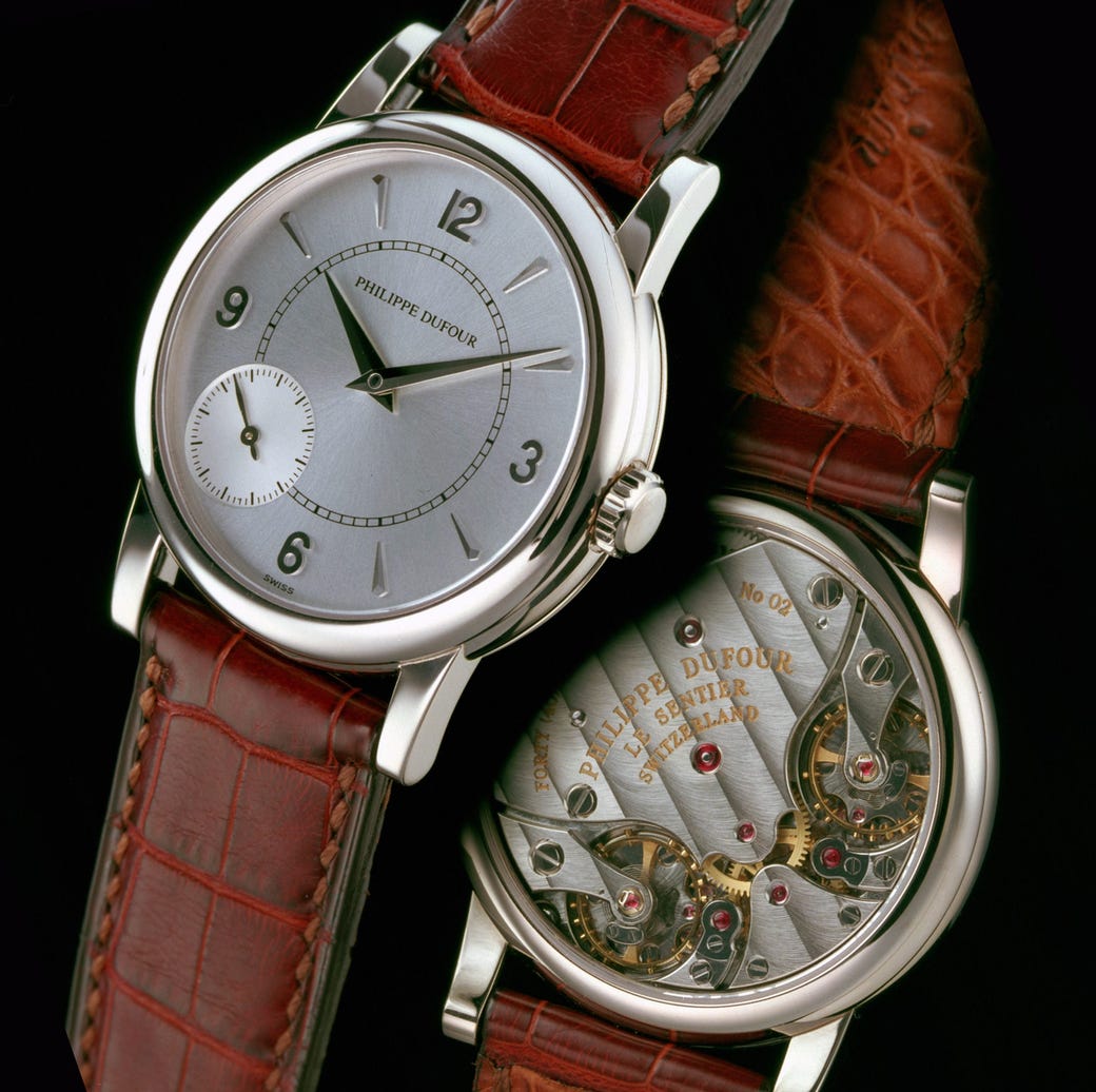
Turn the watch over and the argument gets harder. Ruskin held that the irregularities of living things are “not only signs of life, but sources of beauty,” and that demanding perfection of a craftsman made a slave of him, which he called the old Greek and present English fashion. The Parthenon’s curves sit oddly with that. Hand finishing looks like the place to prove him right. It isn’t. Philippe Dufour’s Simplicity has plates and bridges cut by machine; Dufour then finishes the angles by hand toward an unbroken line of light. Visible unevenness would be a defect. On the other side of the watch, enamellers fire a dial again and again to make it homogeneous, and throw away the ones that bubble. What separates hand from machine shows mostly under a loupe: crisp inward corners no rotating tool can reach. Harmony works here too: bridges whose lines answer one another, a back that speaks the language of the front.
Time adds a third distance. Writing about Greek statues, Yourcenar observed that we have never seen one as its makers did: the paint long gone, the marble worn back toward raw stone. To the beauty the sculptor intended, she argued, time adds an involuntary one. Some dials change colour. Movements wear. Nobody chose it. Some of it is an improvement.
Remove the caption, the word hand-finished, the story of the kiln, and ask what the eye still sees. On the dial, nearly everything survives: the crown breaking the circle, the small seconds pulling the face downward, the hands refusing to mirror one another. Anyone can see them. Under the loupe, the thesis survives only in its weaker form. What the eye admires in a hand-polished bevel is not a flaw but how close the hand came to having none. At arm’s length, beauty is order nudged out of true. Under magnification, it is the near miss of perfection.
The column was never trying to look straight. It was trying to look as though it were holding something up.
About the Author
Sergio Galanti is the founder and editor of WatchDossier, contributor to Italian and international watch publications, the author of Against the Grain: A Cultural History of Swiss Independent Watchmaking, and advisor to private collectors.
No compensation or brand affiliation influenced this essay. Opinions are the author’s own.
Subscribe to watchdossier.ch to receive more insights on luxury, craftsmanship, and collecting.