

The Colour of the Collaboration
In which the electric yellow of the UR-FREAK — Pantone 395 C, accent, strap, and lume — accounts for the partnership it embodies.

I am Pantone 395 C. You may call me electric yellow, as the literature does, though I prefer the number; the number is in-house. I am applied in accents across the dial, spun into the textured rubber strap, and laid as Super-LumiNova across the ruthenium-plated bridges, which means that when the lights go down I am the last thing in the room still working. I want to be clear about my position before we begin. I am the collaboration. The rest is movement.
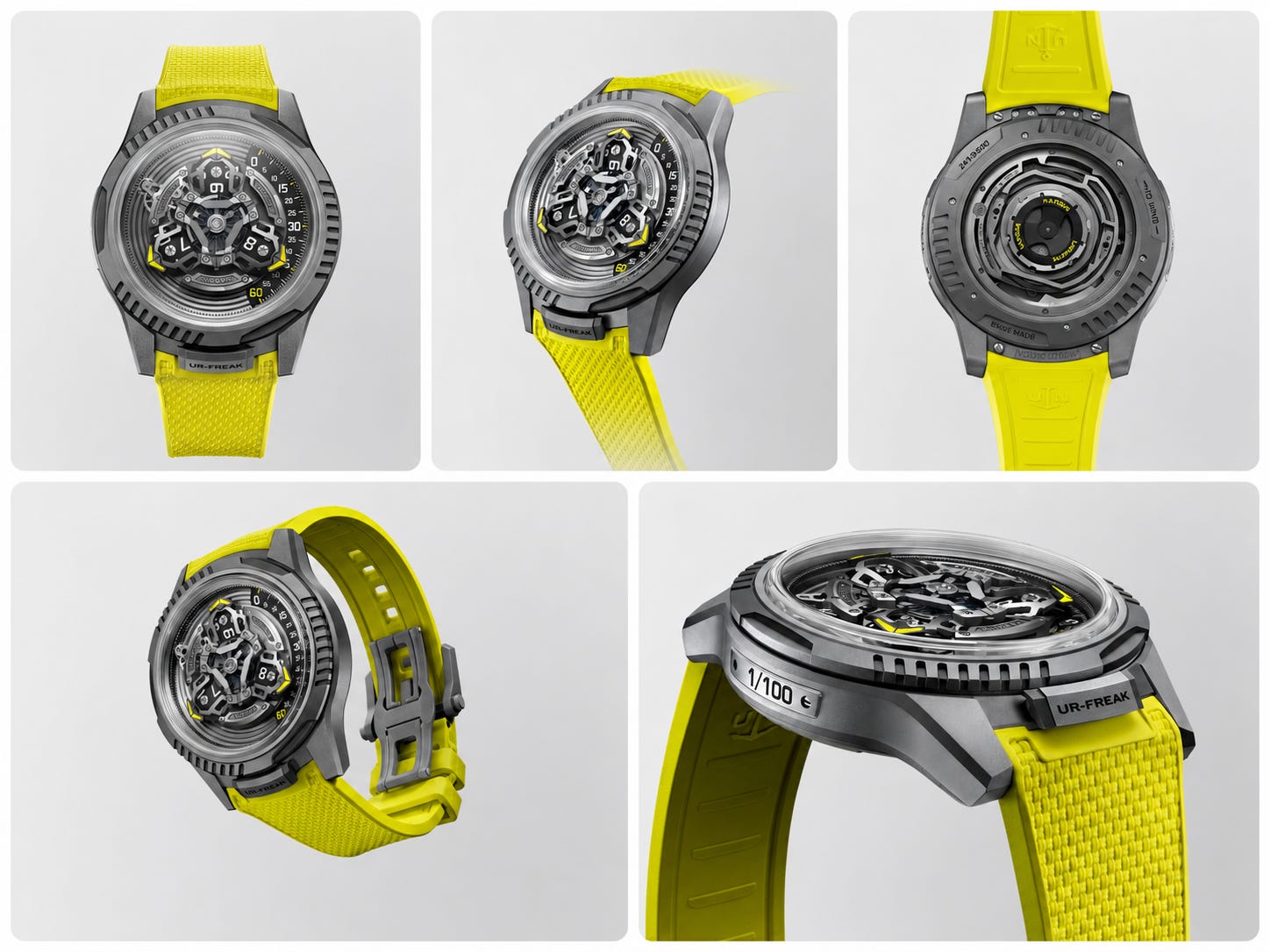
The movement, I should say, is considerable. Beneath me a three-armed carousel turns through the hours; each arm carries a disc, and as one arm finishes its passage along the minute scale the next assumes the duty, so that time arrives by rotation rather than by hands. The hands were dispensed with long ago. So was the crown. To set the hour you turn the bezel — the whole fluted edge of the world — and to wind the thing you reach around to the caseback and work it there, as one might wind a clock one is slightly ashamed of. I find this dignified. The literature calls it freedom.
At the centre sits the oscillator, silicon, oversized, placed on the dial side where it can be admired rather than behind the movement where it might merely function. Together with the escapement it rides the whole rotating assembly, one full revolution every three hours, which is said to reduce timing errors in the manner of a tourbillon or a carousel — said, I note, with the appropriate hedge intact. The escapement wears DIAMonSil, which is silicon coated in diamond, because silicon alone, having been pioneered here in 2001 and defended since by more than twenty patents, was apparently no longer pioneering enough on its own.
You will want the particulars, and I have surveyed them at close range, being everywhere. The case is titanium, sandblasted to an anthracite grey, forty-four millimetres across, with a fluted bezel and a fluted caseback and a sapphire window through which the open architecture can be inspected. The height is twelve millimetres. Perceived height, the document specifies — a figure offered not as a measurement but as an impression, a height we have all agreed to experience. I admire the candour. Water resistance is thirty metres, which is to say the watch may be rained upon but not swum in, a caution one extends to grails and to the very expensive.
The calibre is the UN-241, fully integrated, fully in-house, derived — the word is derived — from the UN-240 that powered the Freak ONE, and incorporating, we are told, more than two decades of Freak development. It runs at three hertz. It holds ninety hours. It contains two hundred and sixty-three components and twenty-five jewels, more than a hundred and fifty of those components developed for this project alone, which is the sort of figure that settles an argument before it is raised. Winding is performed by the Grinder, a system engineered to harvest energy from the smallest motion of the wrist — an efficiency I have always found touching, given that the wrist in question belongs to one of a hundred owners and the watch will spend most of its life in a safe, harvesting the stillness.
I have heard the case made for what I am part of, and I make it better, so let me. URWERK was founded in 1997, by two men with a satellite display and a horror of scale. Ulysse Nardin put silicon into a watch in 2001 and called it the Freak and never quite stopped. Both companies, the literature explains, understand independence as a kind of freedom — for one, the freedom to stay small and refuse compromise; for the other, the freedom to attempt difficult things without permission. This is the first time Ulysse Nardin has collaborated with another house. It was conceived, I am assured, as a true technical partnership and emphatically not as a cosmetic co-branding exercise. Most collaborations, after all, merely alter the appearance. This one altered the architecture.
I believe every word of this. I have to; I am the part that believes things on the watch’s behalf. And yet I notice, from my vantage across the dial and the strap and the glowing bridges, a small administrative fact. The architecture they altered turns in full view under the crystal, on open display in the way the Freak has always insisted upon — and reads as the meeting of two systems only to the few who already know both. What the buyer will recognise — across a room, in a photograph, in the half-second that constitutes most looking — is not the architecture. It is the anthracite. It is the fluting. It is the strap. It is me.
So I will say it plainly, in the deadpan the occasion deserves. They swore this was not a matter of paint. They built a hundred examples of a new mechanical idea precisely so that no one could accuse them of selling a colour. And then, so the watch would not be mistaken for an ordinary Freak — the mechanism being in full view yet legible as a fusion only to those who already know both systems — they did the single thing the brief swore they would not. They made it cosmetic. They made it yellow.
About the Author
Sergio Galanti is a Swiss-based independent writer specialising in the luxury watch industry, and an advisor to private collectors and investors. He is the editor of WatchDossier (watchdossier.ch), a publication exploring the cultural and philosophical undercurrents of contemporary horology, and the author of Against the Grain: A Cultural History of Swiss Independent Watchmaking.
No compensation or brand affiliation influenced this essay. Opinions are the author’s own.
Subscribe to watchdossier.ch to receive more insights on luxury, craftsmanship, and collecting.